Filed under: A Forgotten Era,Art,Books and magazines,Graphics,Reviews
Nostalgia is funny thing, right? Collective memories deform the past, cycle brings most remembered parts of each era which can productively be turned into something new or shitty pastiche. Often a caricature of era made to cope with future that some regard as bad, instead of having a productive view of the past. With this some things get lost and possibly obsessive diggers as me can shine a light how actually it looked, how that era perfectly re-shaped things of the past. And I really want to show some of these things.
Turn of millennium, heck, 90s in general are forggoten since everyone is still drooling over 70s, slowly moving to 80s. When it was a revolutionary era – from DTP revolution and design being way more accessible, a definite move from paste-up process and phototypesetting combined with entirely new generation of designers who truly embraced new technologies. Gen X-ers with their nostalgia of 70s with optimism for the future created some of most interesting works.
An avalanche of little design companies happened – you now only needed a capable computer and proper software for a start. There are some that were big and are fondly remembered and there were more of them that were big at that time too but they somewhat got forgotten – Farrow Design, Intro or incredibly obscure Blue Source. There was a thing common in all of them – a comeback of International Typographic Style of the 60s and 70s happened, but it was noticeably warmer. Without limitations and with better print techniques, photography and illustration omnipresent in current design.
Especially illustration got its renaissance. After being on side of photography, it slowly started to have a resurgence after long absence and became an integral element of hip album artwork, ads or now forgotten, lifestyle bibles. Especially around 1998-2000, The Face magazine truly embraced it – some issues could have fully illustrated features instead of using just photos.
You got them on magazine covers, many hip ads – I think often about ill-fated V Cola which ads were made by Jamie Hewlett or these Carhartt (yes, workwear was trendy at that time too) ads illustrated by Evan Hecox (featured in this book). Chemical Brothers, Super Furries, Back to Mine compilations or Air come first to my head when I think about illustration on album artwork, could go on forever.
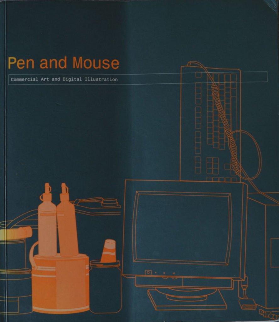
Celebrating the resurgence of iilustration as the de rigueur accessory for many of today’s fashionabie
Illustration becomes popular again, Sleazenation magazine, July 2001 (excerpt)
magazines, Angus Hyland of Pentagram Design has put together a tome entitled Pen And Mouse.
It features a new breed of illustrators whose engagement with new technology varies. A good illustration, of course, is iike a pictorial poem; a condensation of an idea or a feeling,
and there are many good examples within.
Although the premise of the book is a celebration of the ease with which the featured artists are
able to dovetail the craft of the pen and the technology of the mouse (hence the title), the real
fascination Iies in the dichotomy between the two media. It’s also striking how influential fine
artists seem
to have been on this generation. Check it out and decide for yourseif which is mightier, the pen or the mouse. MW
Pen and Mouse book is probably only collection of works that weren’t only fashion illustration of that era I know so far. When illustration in States seemed to revive more of pre-50s styles and it wasn’t about hip life, Europe (especially UK) higly embraced a part important for lot of 60s and 70s illustration – lifestyle used to sell, instead of just showing the product. Maybe with bigger influence of fine art as Sleazenation mentions ( “it’s also striking how influential fine artists such as Bacon, Patrick Caulfield, Hockney, Warhol, Gary Hume and even David Shrigley seem to have been on this generation“) but myself I see also echoes of stuff you can see being discovered again on Illustration Art blog or Leif Peng’s flickr sets. That one certain style, looseness and energy of works by Bernie Fuchs or Bob Peak for an example. Angular lines, the move of fully painted illustration of the 50s.
Now couples and businessmen of the past were replaced with hip urban individuals the 90s. With more techniques available than ever possibilities are endless, new styles emerging. In this book you get a quite a diversity of style – fully traditional paitings, experiments with photo manipulation, vectors or 3D modelling. Some distinct styles appeared like screen printed collage-y look or this specific type of vector based illustration, simplified realism for most of the time.
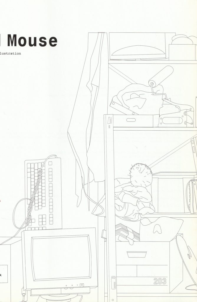
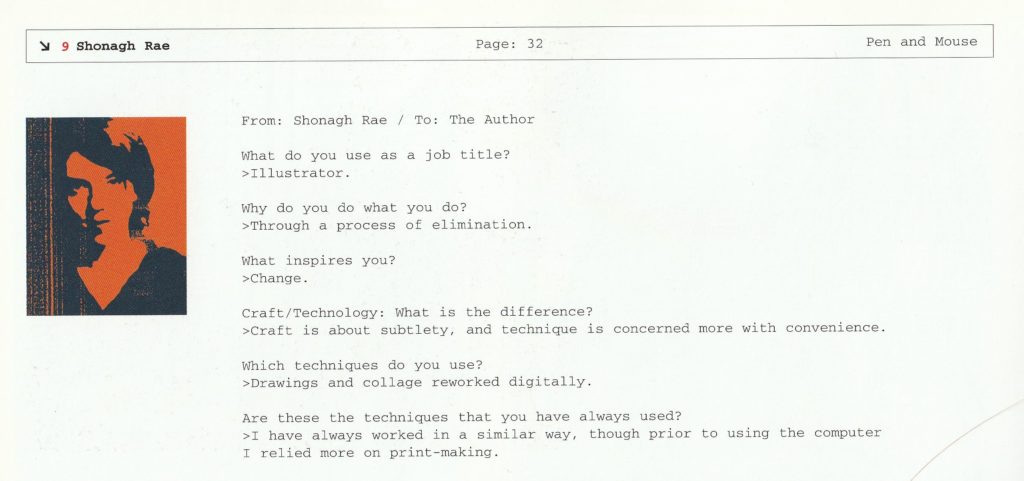
Artwork for book itself was taking on popular styles, feautring new tools of the trade – the computer. Opened with an essay about new forms of it, entire comeback after absence for quite of time and how new technology influences craft and process. Each artist is interviewed in form of little bio with self-portrait wit answers – some laconic or more detailed, often giving a good insight on the process and inspiration. It’s worth to note they are also asked what title they use – since illustration and graphic design strated to live in symbiosys and became almost interchangeable.
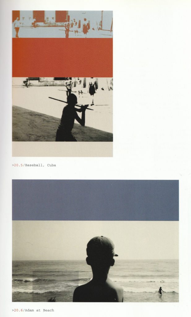
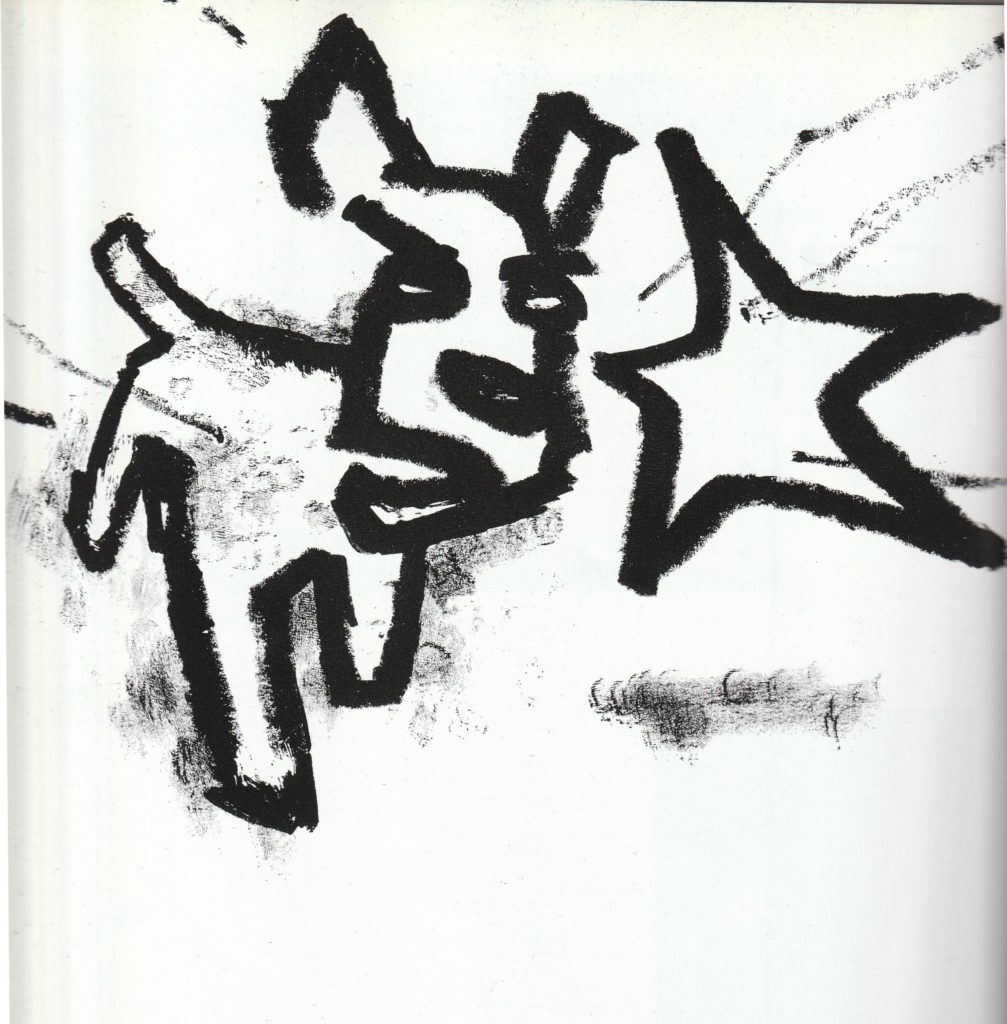
Possibly the most prominent style, maybe based on my picks but there was more of collage-y, screenprinted stuff compared to vectors or CGI stuff in the book. High on texture, lot of woobly lines and strong forms, loose painterly styles. Visible splashes of paint, all of these imperfections. Lot of them got that retro handmade vibe – more traditional techniques, but still embraced some of new possibilities, like use of Photoshop.
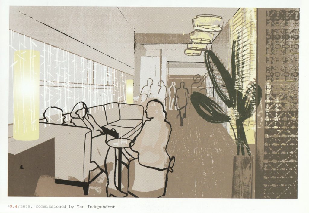
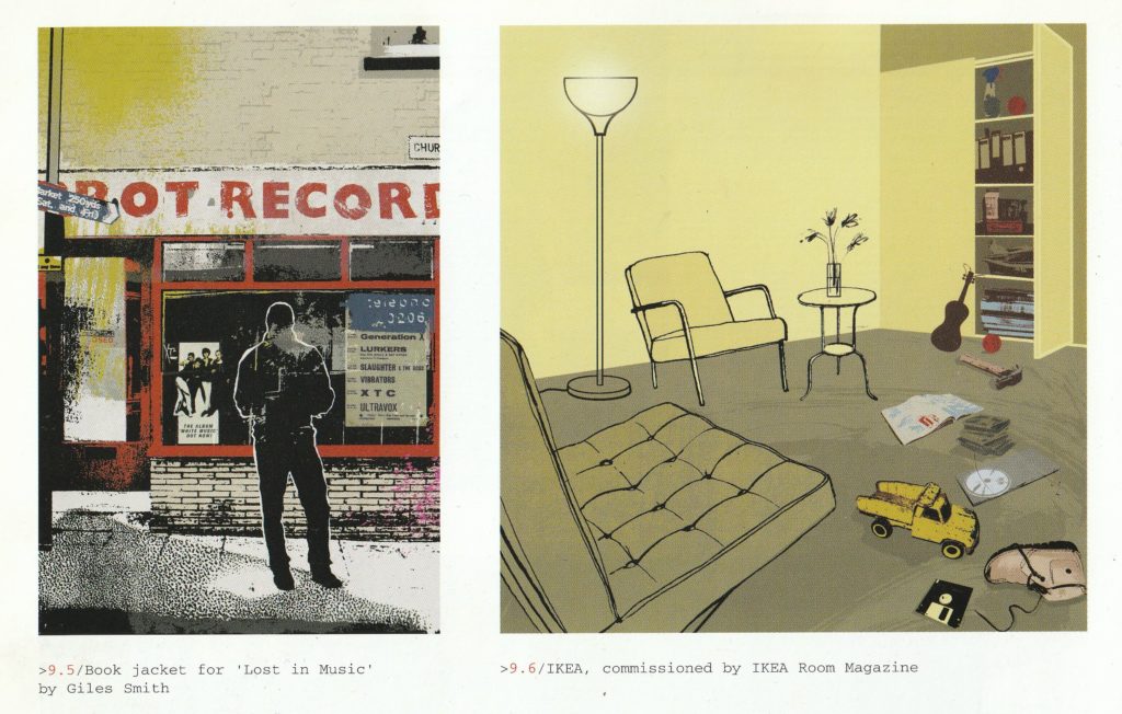
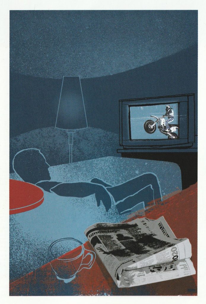
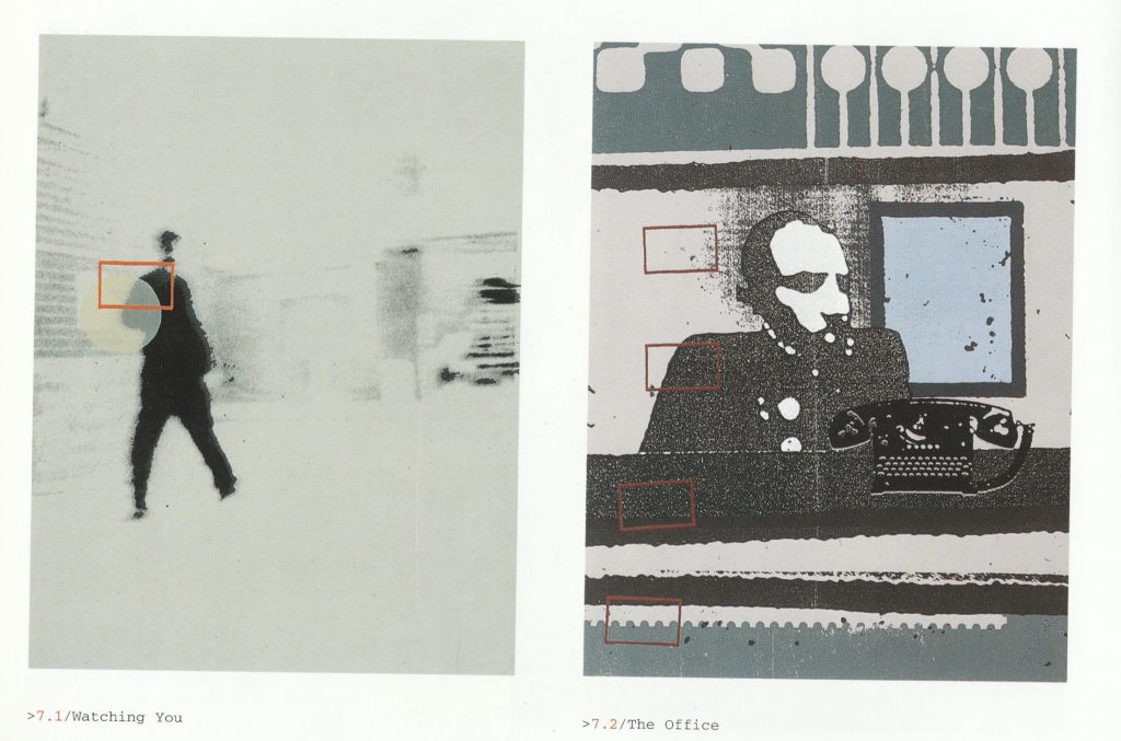
Honestly all of these illustrations, no matter the style truly show that mythological cool lifestyle of Gen X at the end of the century. This showcase, after 20 years this year is a literal time capsule of an era which gets popular again, though for me not truly appreciated. End of transitional period, when in illustration traditional techniques were still embraced, a bit before 00s vector explosion – which overtook illustration almost entirely, guess because of good use in web design (easily scalable, works perfectly in Flash).
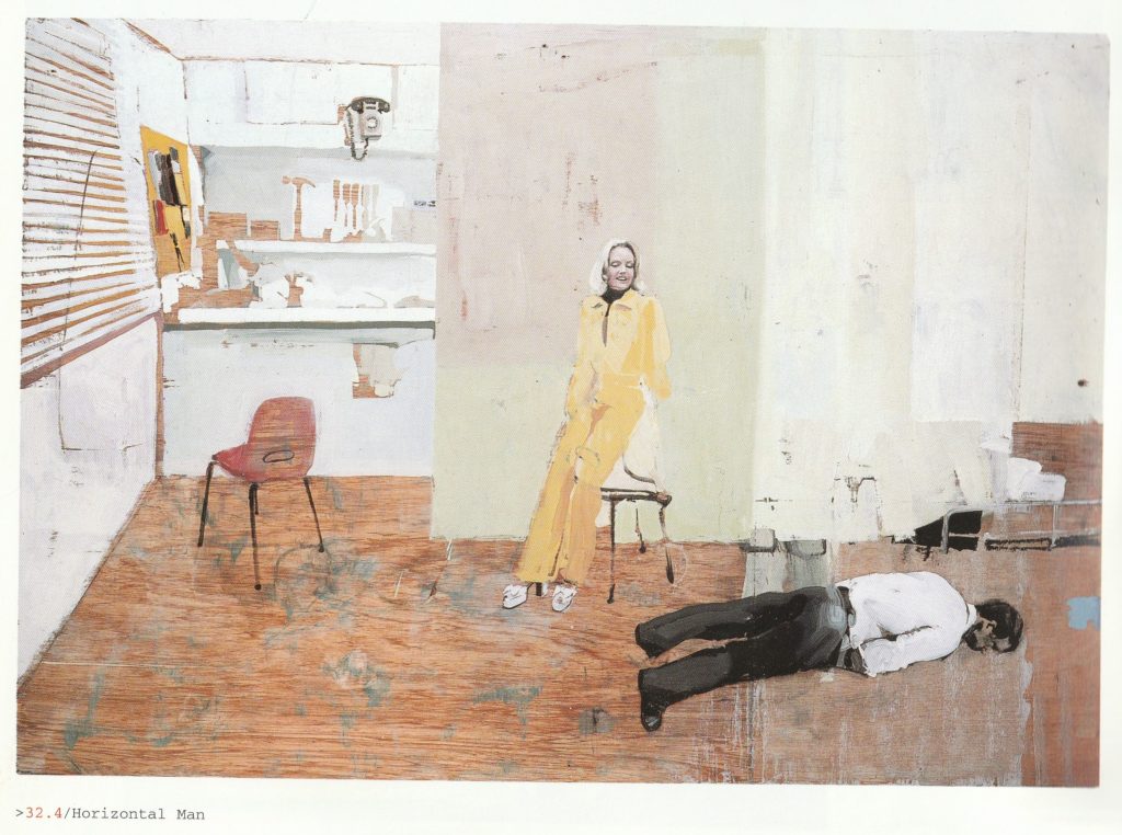
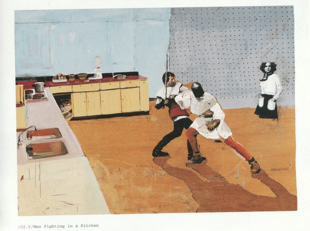
New places to hang out with your friends, new utilitarian fashion styles, nostalgia for 60s and 70s, chidhood of Gen X. Both optimism and paranoia, life in this moment but looking forwards not so far future. This hip urban lifestyle, craved by youth (now up to 35 years of age). I can think about few other pieces of media that show this perfectly. All of these style bibles from the UK which lost their momentum after 2000 and became shadows of themselves, just boring fashion magazines and Spaced, showing group of friends with “cool” creative jobs of that era, clubs and poking fun at current phenomena like YBAs ovbiously with sountrack of the time – lot of electronic music, which after final death of Britpop finally took a steady but short dominance in mainstream. (Downtempo become literally TV ad-core btw).
It seemed to be very tempomary, ending very quickly, after just few years. Since cool “young adults” started to get older and having families, new decade kicking in with entirely changed moods and outlook of the future.
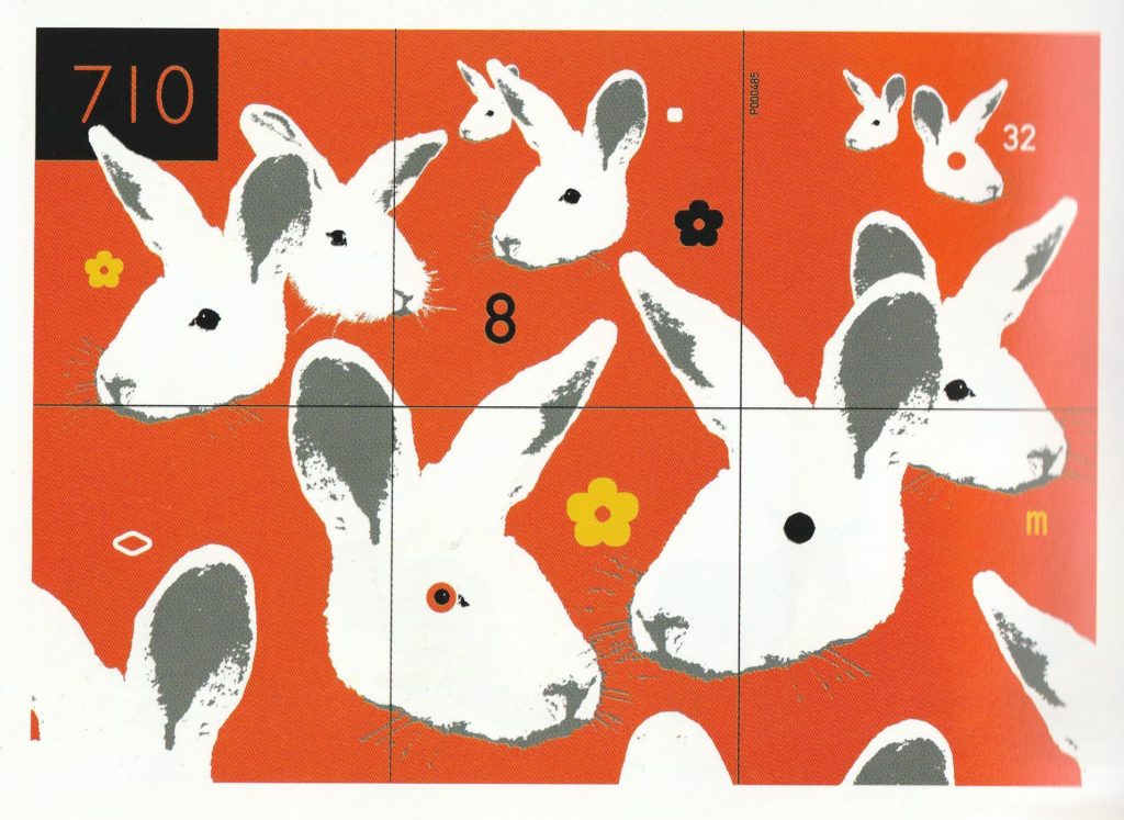
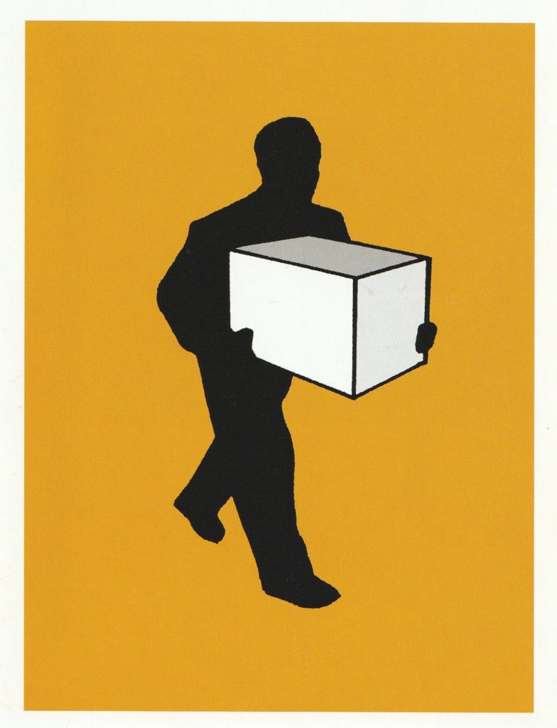
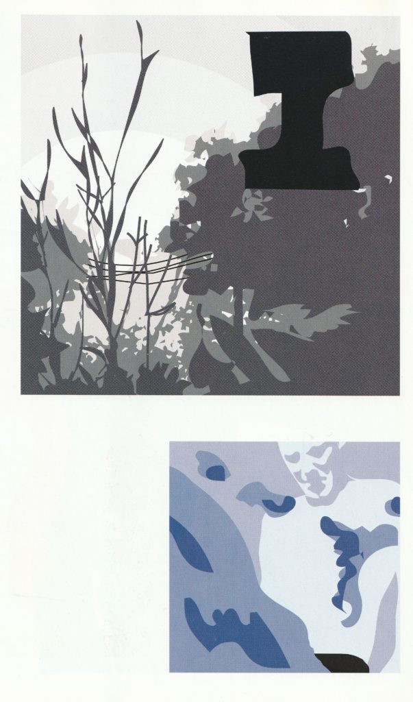
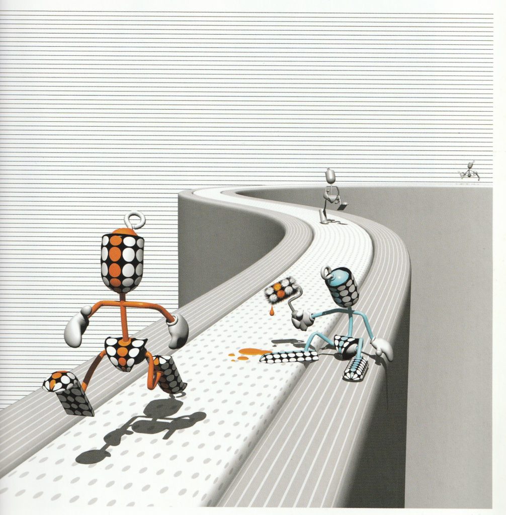
Clean vectors were a bridge between pure CGI and traditional stuff. Playing on posterization effects and simplyfing realism, going for paint-by-numbers thing. Some got a vibe of instructional illustrations found in user manuals. Cold, minimalistic and can be pixel-perfect. A good contrast with warm, retro screenprints I’ve shown before.
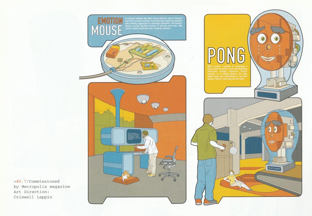



I feel like those who went for more CGI/computer manipulation were in minority among all of feaured illustrators. Too few of them for a book literally called Pen and Mouse, but at least picks were great. Cityscape collages of Nick Higgins, Shiv’s photo manipulations or alien-like figures of Faiyaz Jafri – all of this versatility in use of computer software and skill required for this.
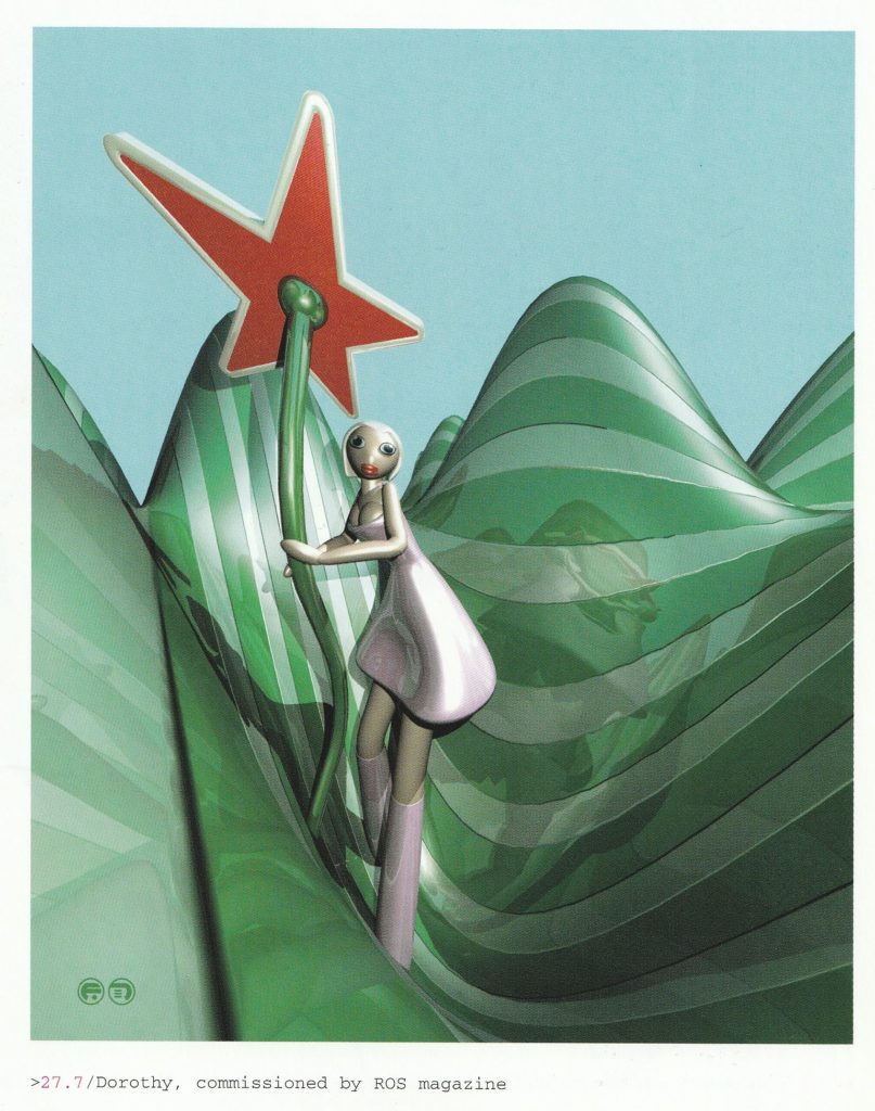

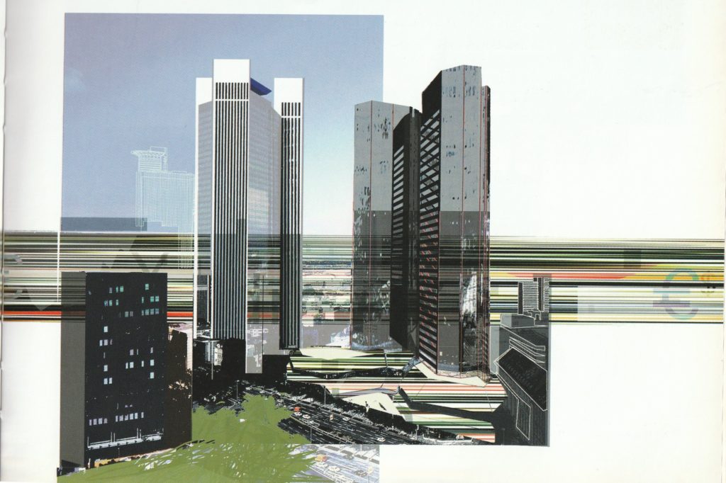
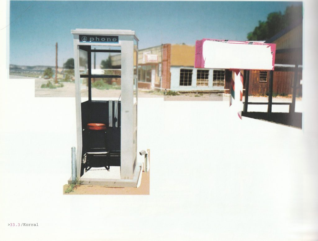
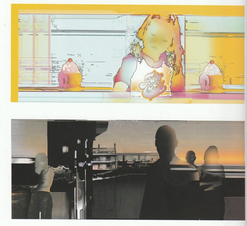
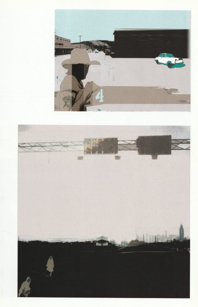
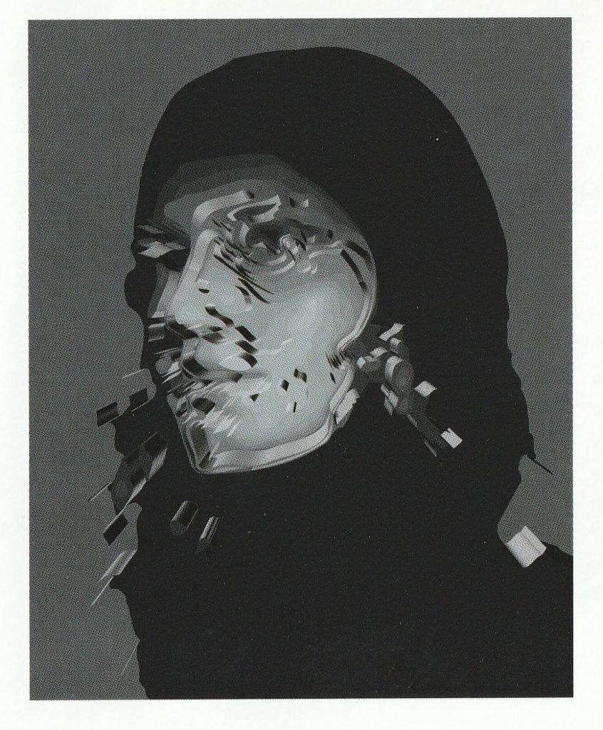
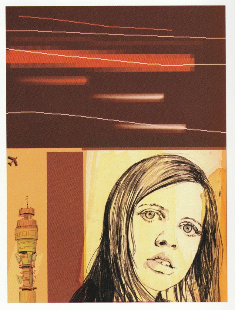
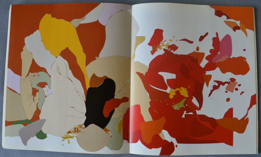
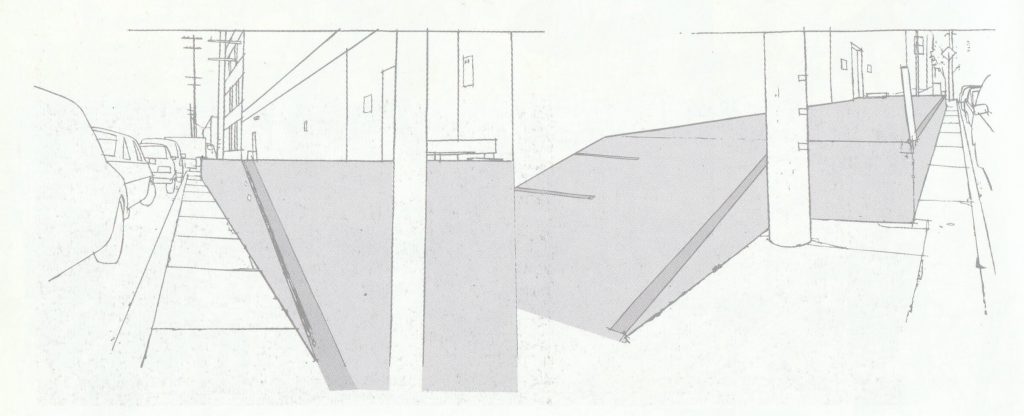
Print quality of book is really nice and some illustrations were two page spreads – it’s fun to view them in bigger size than usual one!
One shown here, by Kim Hiorthoy (also an Experimental/IDM musician). Also he did quite lot of album artwork, few of them featured in Sampler 2 so I guess it’s better material for another post.
With 45 illustrators featured in this book, it was hard to write something more specific about each of them, even most of whose work I selected for this post. There are few whose work I knew before, even if I didn’t knew name sometimes – it just was very familiar, maybe because of all album art for music I listen or just digging through Discogs. I tried to find more information on them if I could and what they are doing now, if they are still working in the industry.
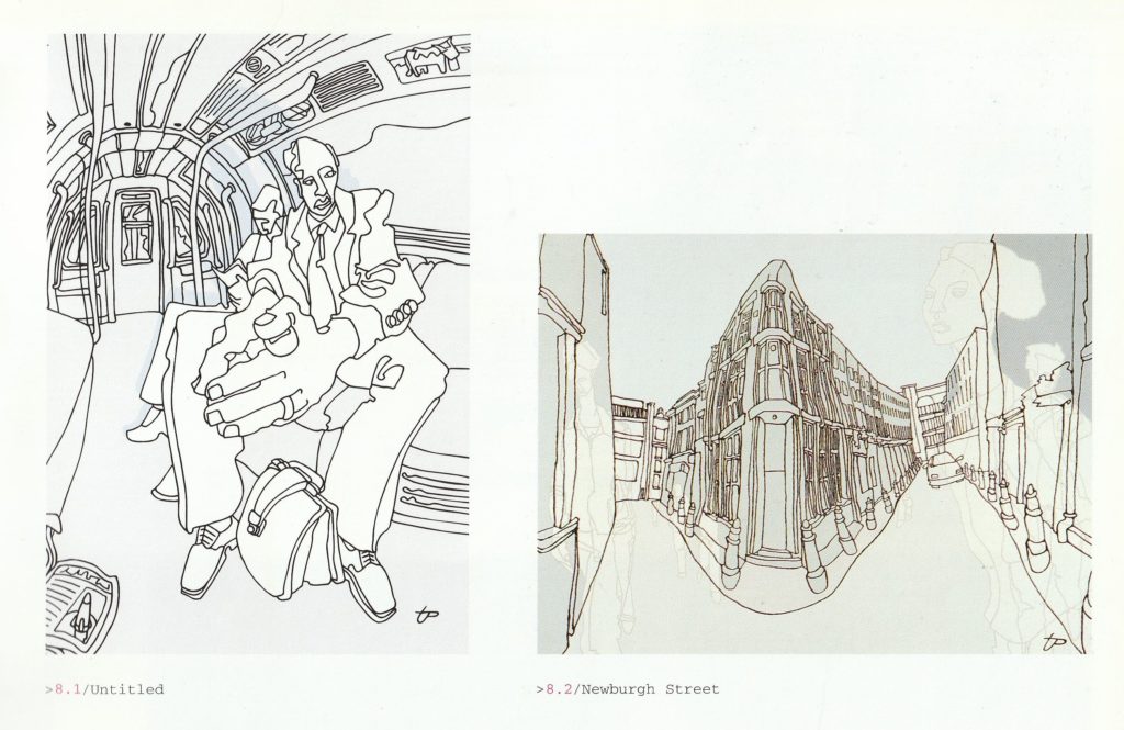
Tommy Penton
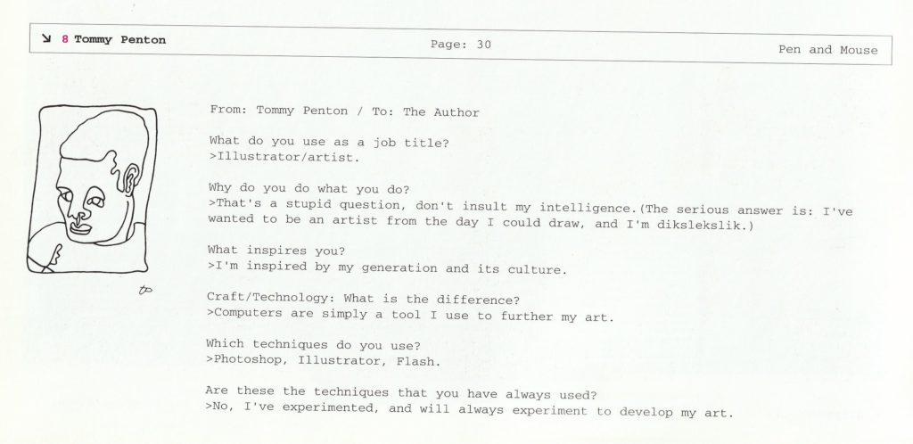
Tommy Penton’s exaggerated figures already decorated some of Back to Mine compilations – some of my favourite mixes and also covers. A good illustration really did the work, when most of these covers were fairly minimalistic with type. Other high profile work he did was cover for Embrace’s Drawn from Memory and singles off it, made with design company Blue Source.
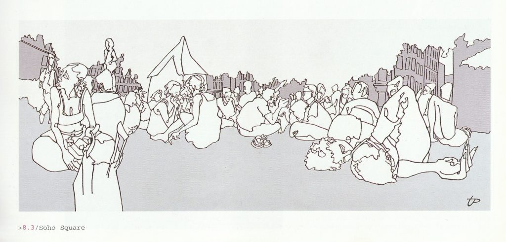
From what I found, he still keeps an fairly active Facebook and Instagram pages. A good mixture of old and new work, his style stayed mostly the same.
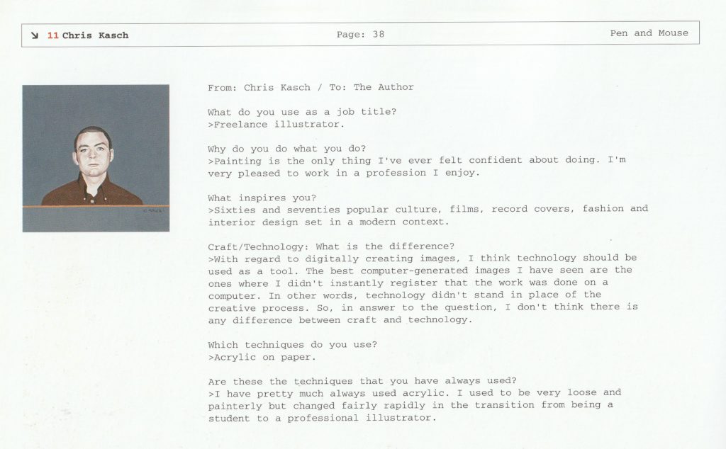
Chris Kasch
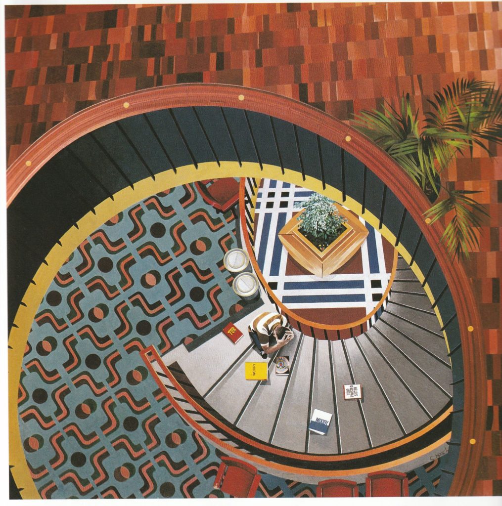
I remember finding this staircase painting on album cover for pretty much obscure band that vanished after one album, Little Mothers and honestly loved it. Amount of craft here is insane, this perspective and care about all of this detail, these patterns! Warmth of colors here is lovely.
Chris Kasch’s work reminds me of David Hockney’s 70s paintings, especially well rendered figures and flat, more solid backgrounds.
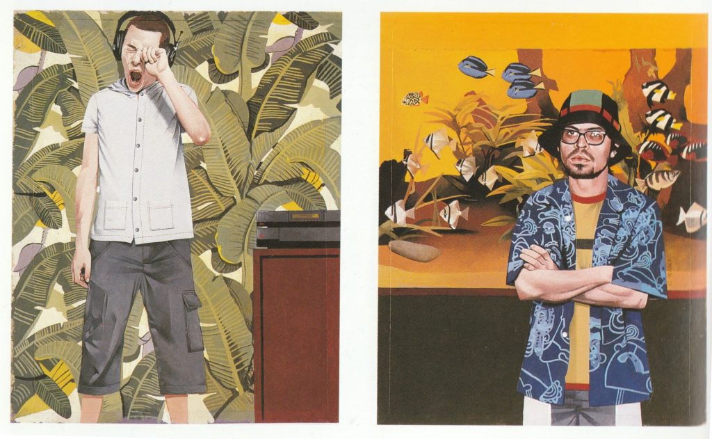
Recontextualization of 60s and 70s for the now was the big thing. Sometimes I think 90s just were the new 70s, but with lot of fun, easier to access tech and more electronic music. Cycle loops again, as it always does.
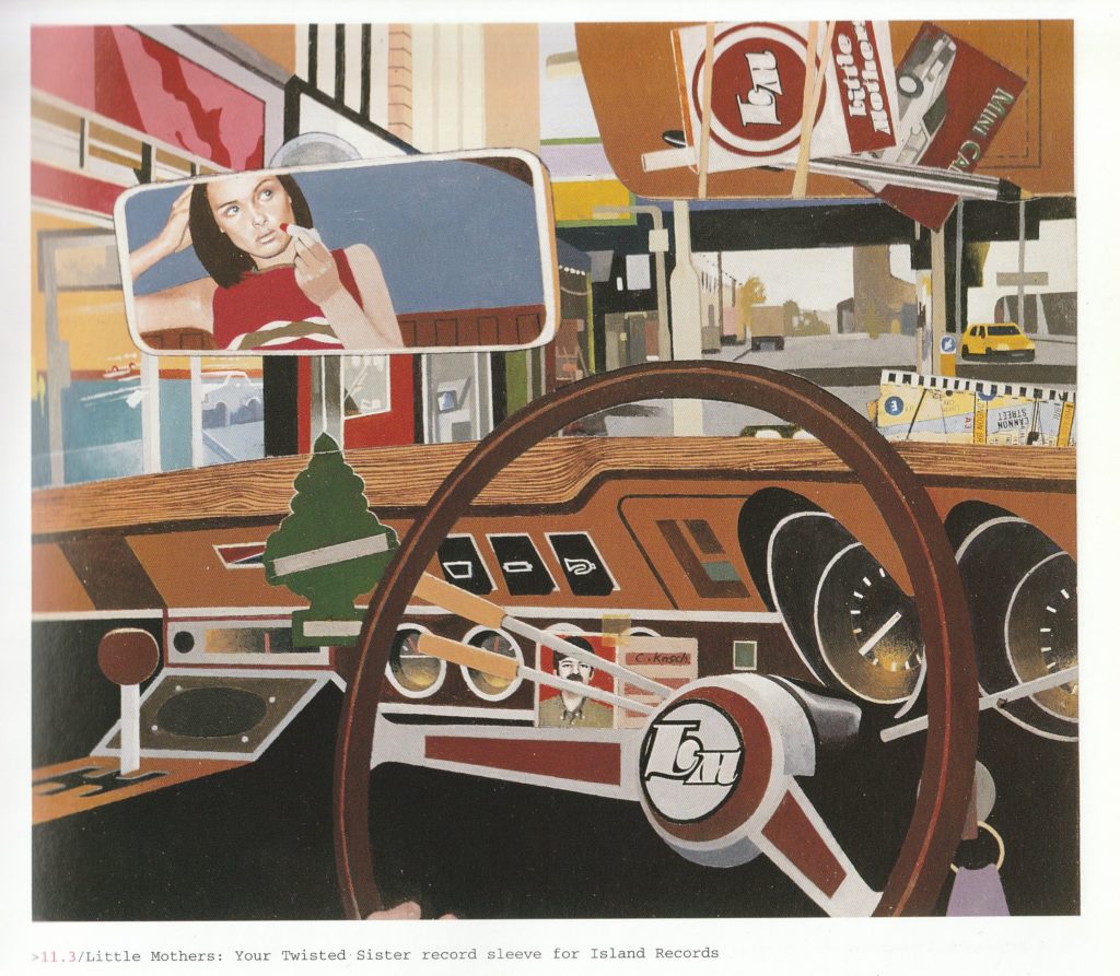
Except this for for Little Mothers, he did illustration for compilation series Music to Watch Girls By and lot of editorial illustrations, awailable for viewing on website. As of 2021, he is now retired from illustration for 6 years already but currently works on music.

Kate Gibb
The Chemical Brothers are well known for many people and artwork for some of their albums is a familiar view for a lot, but few know who’s behind it. Turns out to be a collaboration betwen Blue Source (I mention them constantly but some thing are coincidences) and Kate Gibb for Surrender and Come With Us. It’s pretty well described in one of books from Gas Book series by Design Exchange.
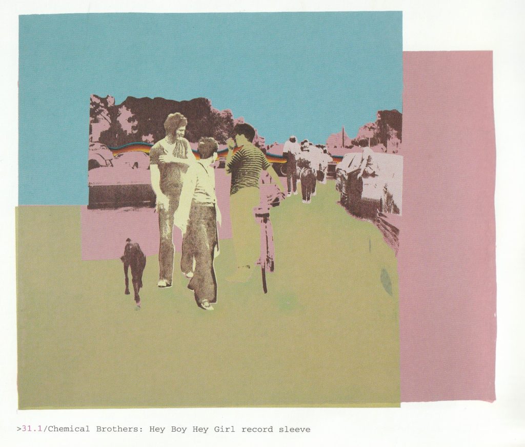
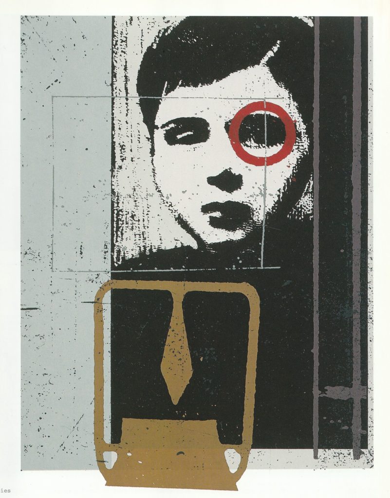
Known the most for her work with Chemicals, she did also album covers for Mono (shown below) and Suede to name few.

I like how her works seem to be “painterly” even if they are screenprints. Lots of layers and textures, photos included in compositions with absolutely vintage feel – again, I feel 60s illustration echoing here.
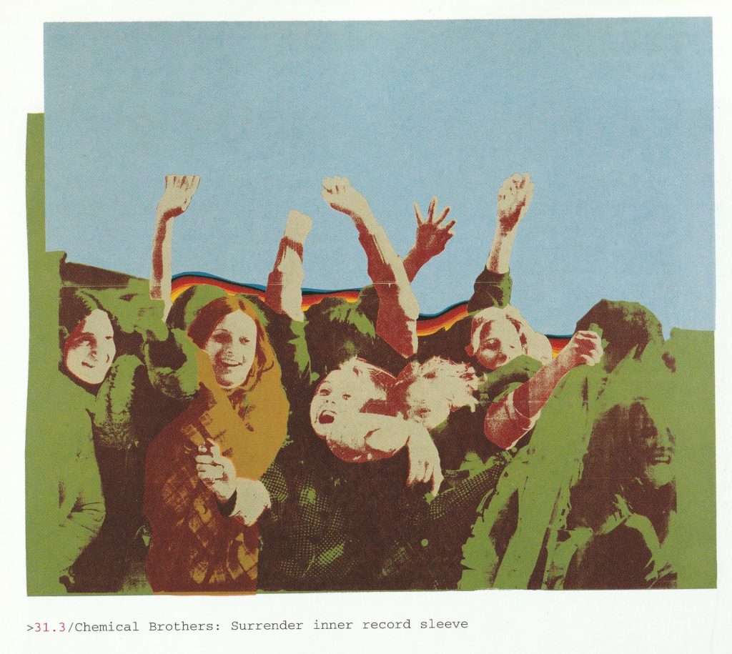
Currently she’s still creating new stuff and you can see it on her Instagram account.
Graham Rounthwaite
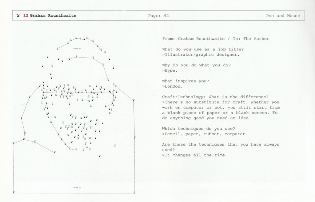
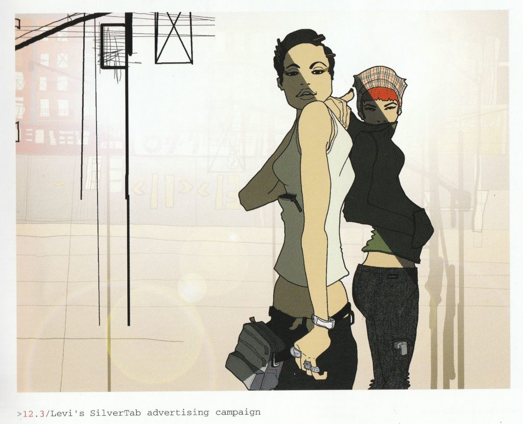
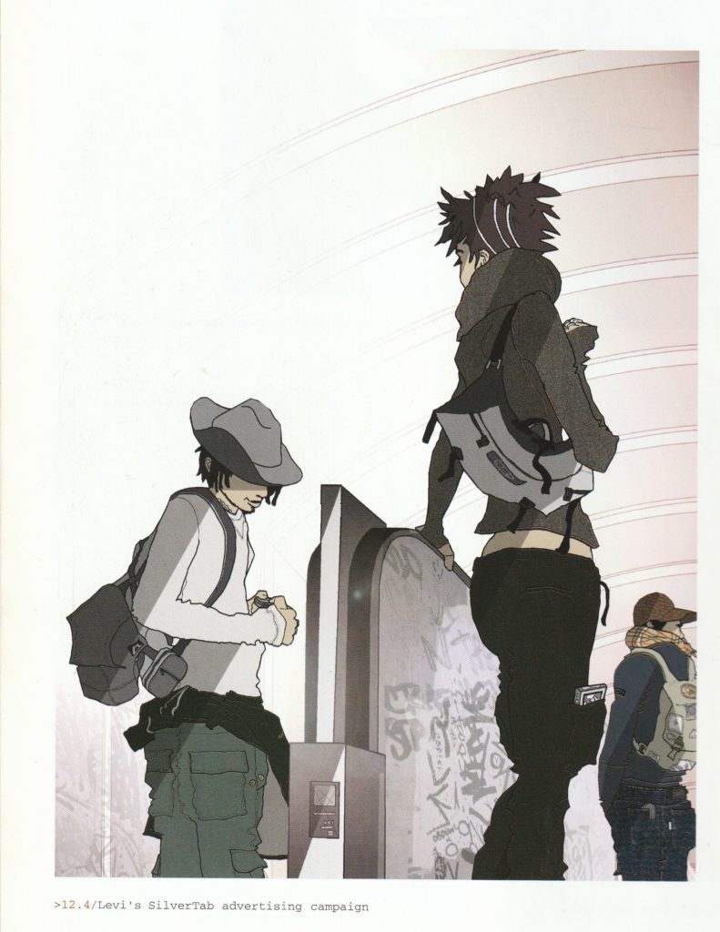
Possibly more known for his work as art director of giants like The Face during it’s last years or currently i-D, Graham Rounthwaite’s illustrations embodied the hip lifestyle perfectly. His angular style, thin lines and caricaturized portrayals of characters were ideal for this. From entire camapign for Levi’s Silver Tab line, Faberge ads (alongside Pete Fowler and Jason Brooks (before Hed Kandi!)) which one of them was considered controversial for drug-related imagery, Off-Centre club and Everything But The Girl’s Temperamental.
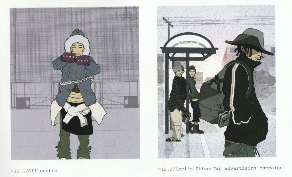
Now, he’s still working art direction jobs in fashion industry, seems he stopped doing illustration somewhere in early 00s and possibly last illustration work he did was Stereophonics’ Language. Sex. Violence. Other?
Evan Hecox

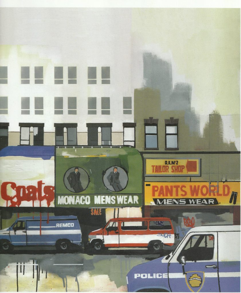
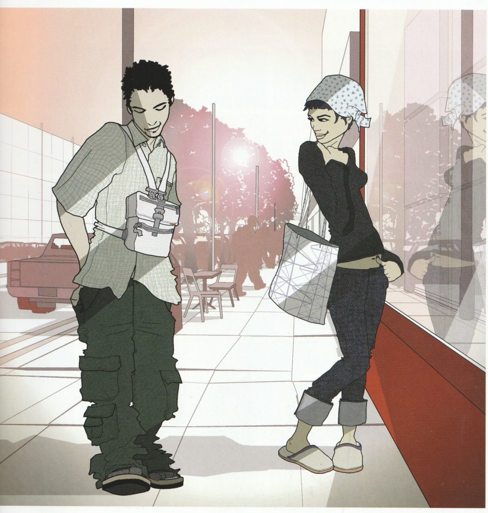
Evan Hecox’s work depicts structures that usually wouldn’t be a subject of typical illustration, for lot too mundane but drawing heavy machinery, architecture of cities, shopping carts and other similar things. His illustration career started with art for skateboard decks and snowboards, T-shirt designs and subjects like this are honestly a perfect choice for things like this.
In very graphic style, they are flat yet you still feel the dimensions and form of objects.
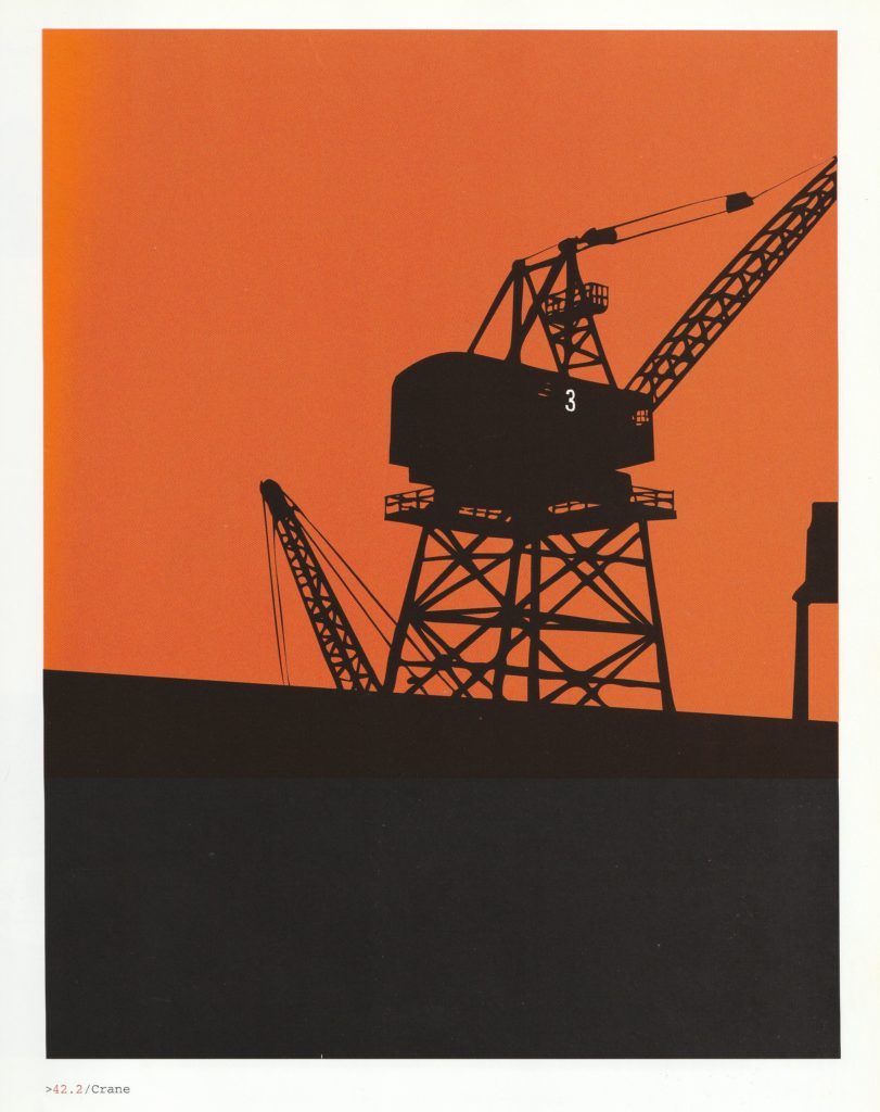
Other notable works are Carhartt ads I mentioned early this post, website lists some high profile clients like Nike or Volkswagen.
He’s still creating – new works are both on website and Instagram, sadly lack of earlier work available for viewing.
Reggie Pedro
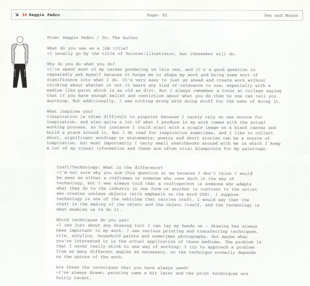
I though I wasn’t able to find some more significant information about work of late Reggie Pedro, but luckily his website (in 2005 vision) is still up!
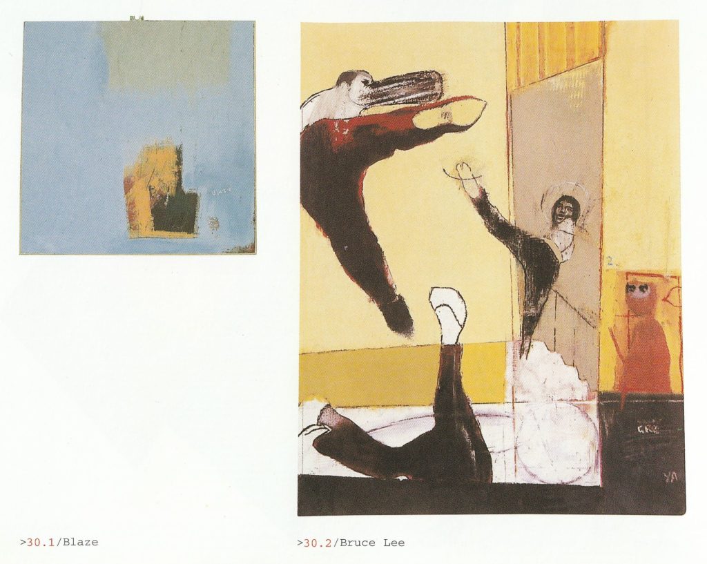
You can feel the energy here. Flowy figures, not really detailed, usually surroundings overpower them if present.
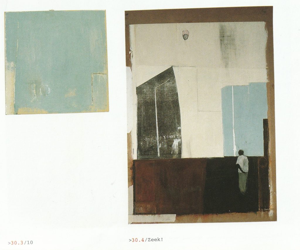
I’ve been able to find more work by him, including personal paintings and commisioned works – notably for Gomez and editorial illustration for publications like Arena or Time out.
Jasper Goodall
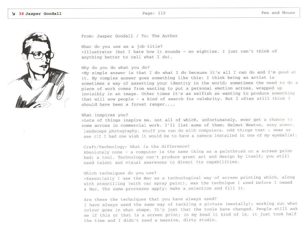
I think I first saw Jasper Goodall’s work way before I got this book, I think it was in one issue of now long-defunct Muzik magazine in an feature about top ten designs of 2002 picked by Fred Deakin mainly of Lemon Jelly fame, but also known for running design company Airside.
I instantly fell in love with all of this detail even if it’s simplified to look like an old poster, limited by print techniques back in the day. It’s flat, yet still got volume and depth.
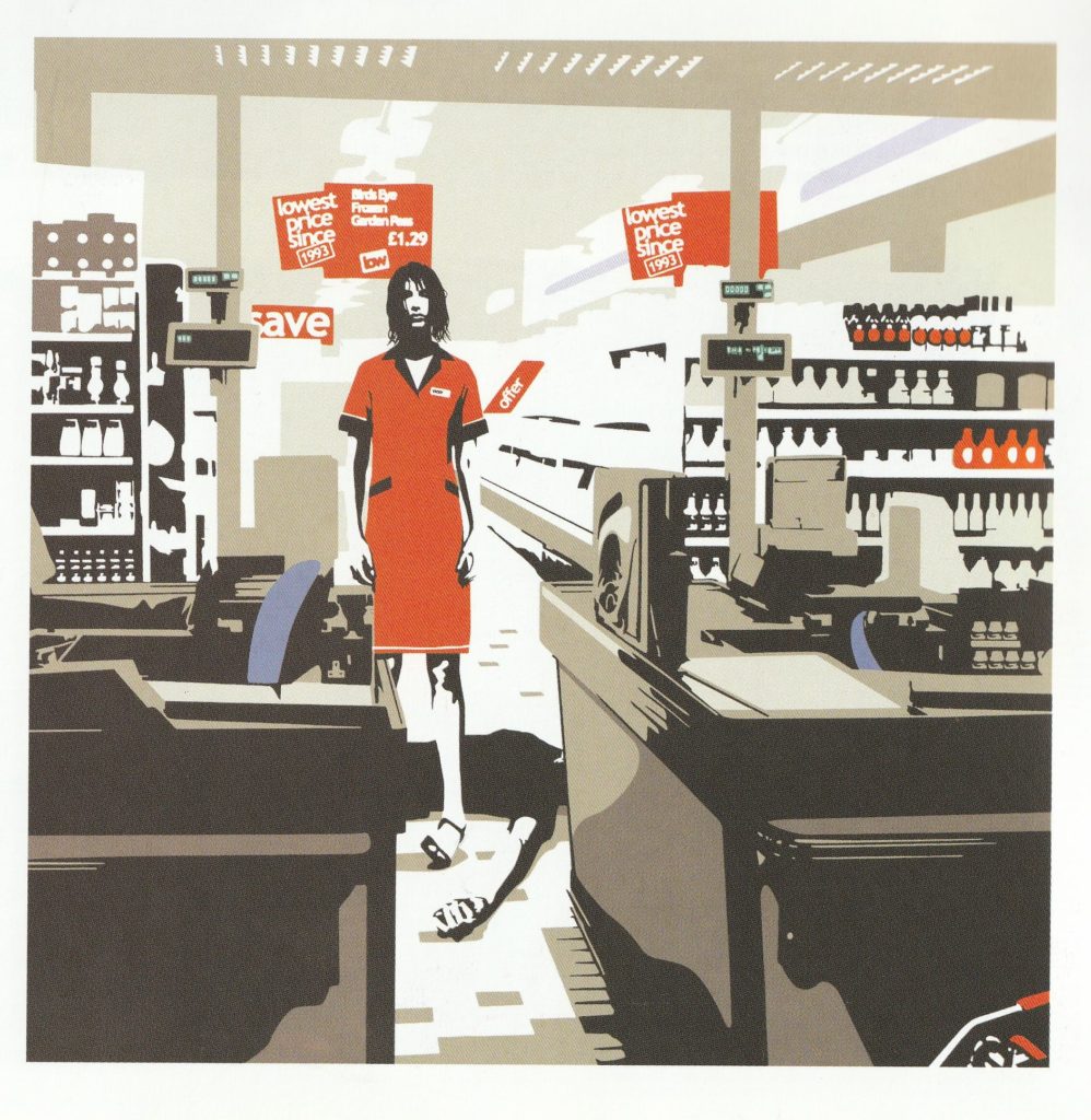
His style is highly recongizable – when I recently was flipping all of The Face issues I got I instantly recognized his work which was featured quite often, starting from 1999.
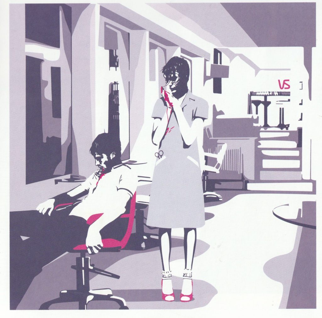
His most known pieces are sexy women, mainly more louder, later stuff from mid 00s. It’s nice to see work before, way more toned down and what I like the most, paint-by-numbers style than more lines. You still recognize figures which still are close to the nature, but rendered in more simplified form.
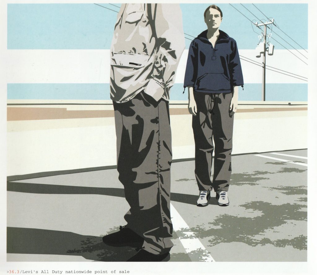
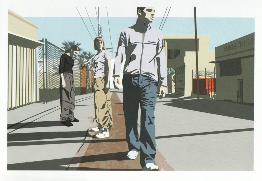
In 2014 he completely retired from illustration, instead this he now does photography – nature at night, often with fairytale-like quality. Even recently featured on the Guardian.
I must say it was the best spent £3,5 so far. Nice print quality, huge number of beautiful illustrations. I could finally see how that era looked and get to know names of people who worked at that time in the industry, besides some stuff I was finding before in magazines and on album artwork. It’s fun to flip through it, as always physical copy will win over digital. More pleasant to view well printed pages instead of botched scans. Coming back to it very often, I feel lot of stuff here already influences my ideas and hopefully soon my own work. I need to play with different styles and techinques to finally find my own voice, get ease of putting down stuff on the paper and having a reference like this surely will help keep being inspired.